

Reckitt // with Design Bridge // 2020 – 2022
Finish: tiering on meaning
Finish is about delivering the best, and it needed room for a tier beyond Quantum. Semiotics, not claims, made Good, Better, Best obvious at a glance.
01 · The challenge
Room at the top
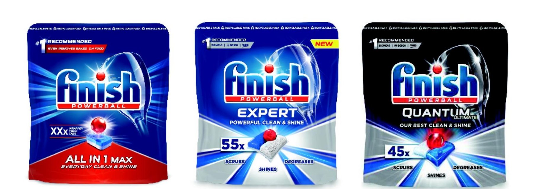
Finish stands for the best clean, and its next innovation needed a tier above Quantum. Stretching the name hadn't worked: US concepts for Quantum Pro and Pro Max never made clear what was improving.
With packs that looked alike tier to tier, the range needed a redesign that showed the difference rather than claimed it.
02 · Objectives
What the design had to do
01
Lead in premium tabs
Become the undisputed leader in premium tabs.
02
Win with thermoform
Make thermoform the lead technology.
03
Compete at every tier
Stay competitive at every price point.
04
Bring purpose to pack
Bring the brand's purpose onto the pack.
03 · The insight
Tier on meaning, not claims
Semiotics are the signs people read without thinking: shine, light, colour and material say "more" faster than copy. So each step up is shown, and a short claim confirms it.
- Use
- The Finish wordmark with the Powerball.
- Invest
- The Powerball and product visual as icons; blue and red as core colours.
- Evolve
- The rays to show shine; an ownable colour system to navigate the tiers.
04 · Exploration
Seven routes, tested from the start
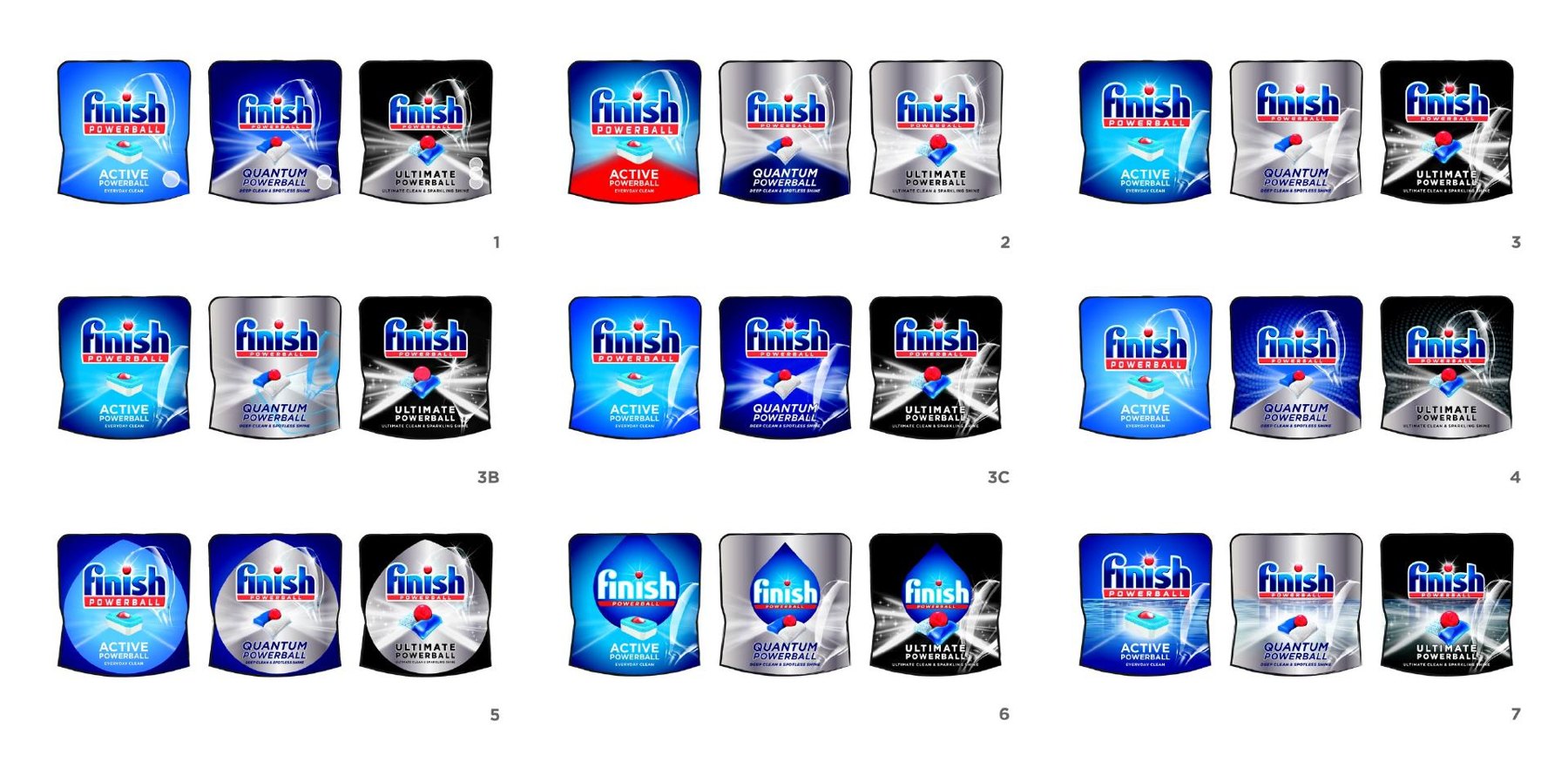
We put seven routes, each pulling a different lever, into initial consumer testing, so we were data driven from the outset.
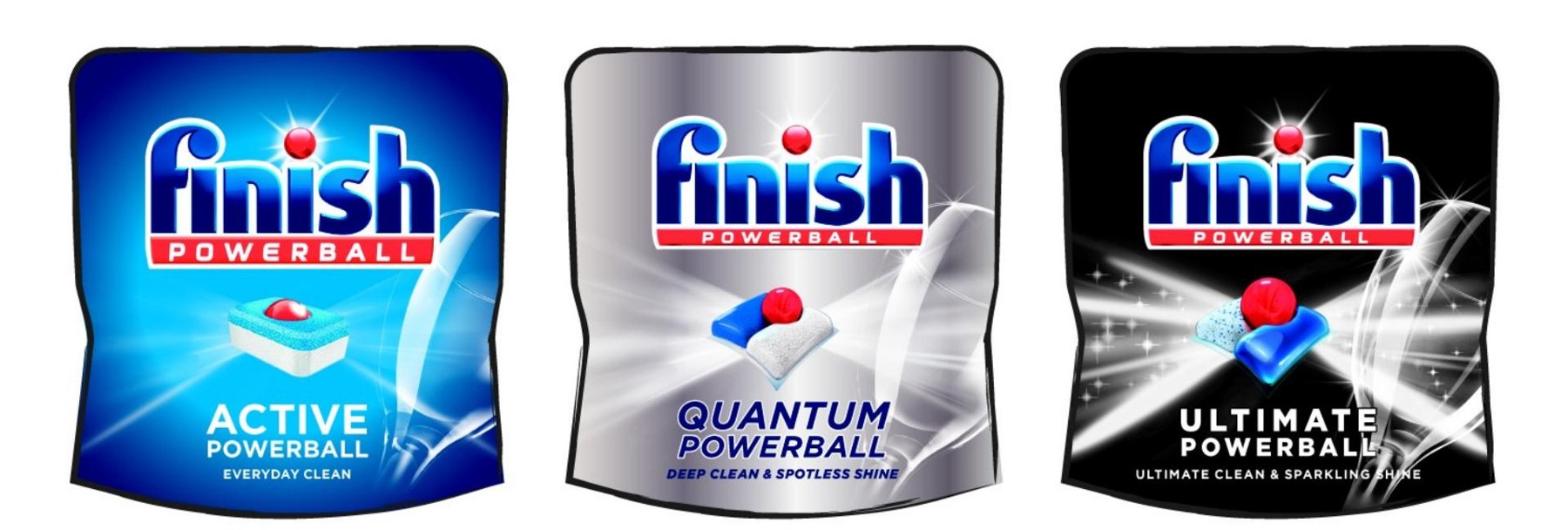
The test: could shoppers spot good, better and best at a glance? Blue, silver and black, with shine building tier by tier, won on clarity.
05 · Reborn
A design that does the selling
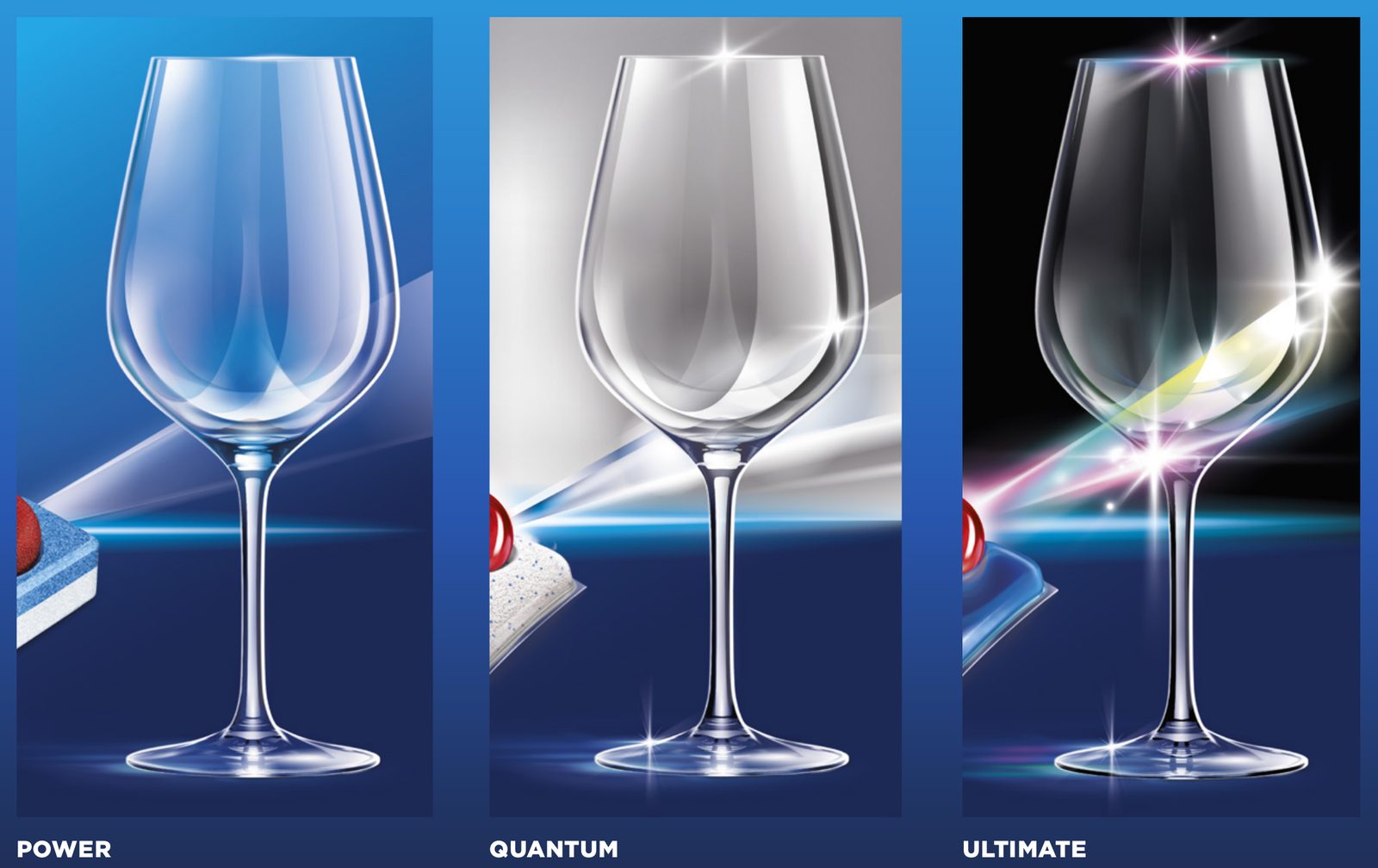
That route became Reborn: the Powerball delivering pristine shine, above an optimistic water horizon.
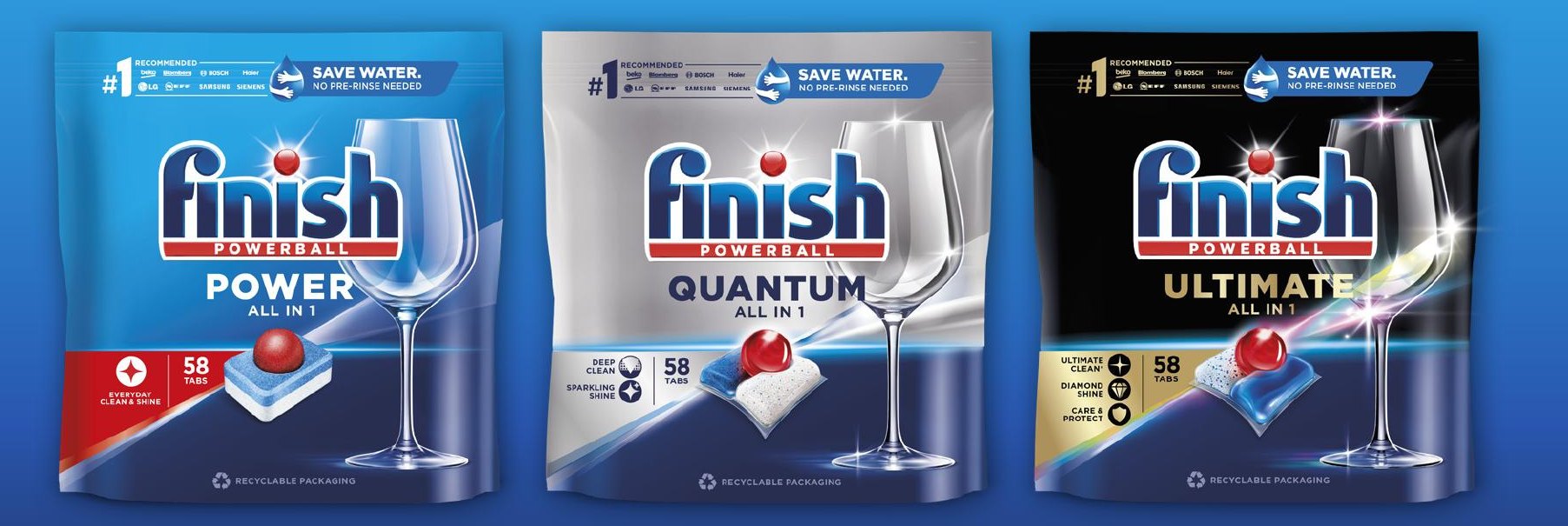
- The glass
- Upright, large and modern: the mark of quality behind the shine promise.
- Light rays
- Build in strength tier by tier, so the shine visibly grows.
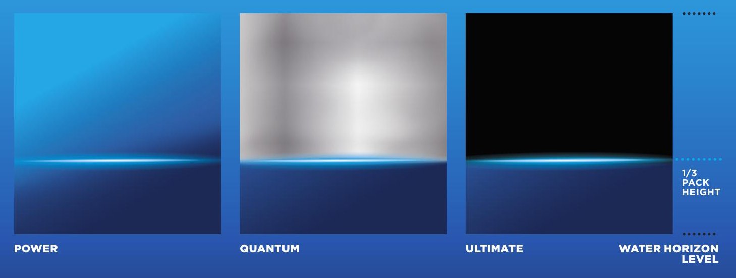
- Water horizon
- A band of blue linking every tier to saving water.
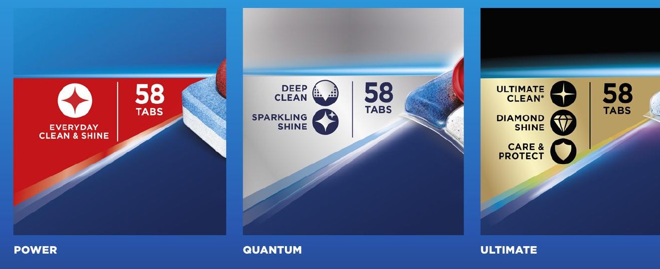
- Performance shard
- One place for the comparison a shopper needs.
06 · Off pack
Beyond the shelf
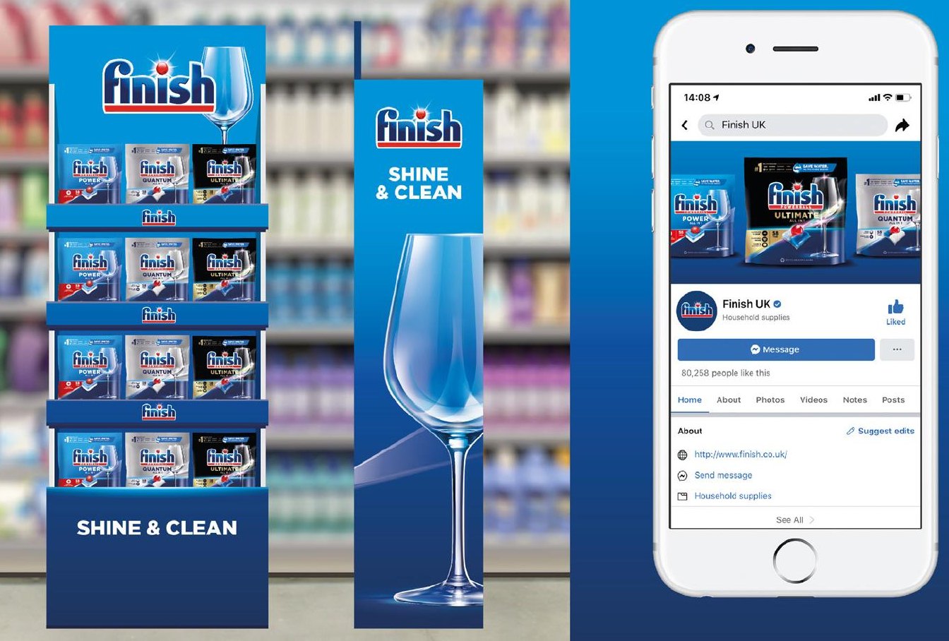
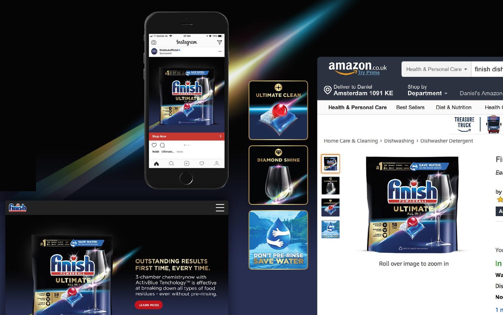
The same rules carry into store, social and ecommerce: Power blue when the brand leads, the tier's own colour when one tier does.
07 · My role
Leading it client-side
As Brand Experience Lead at Reckitt, I led the redesign with Design Bridge, from brief to guidelines. It made room for on-top innovation as Finish grew into a $2Bn brand.
Design: Design Bridge // Client: Reckitt