

Reckitt // with Design Bridge // 2020 – 2022
Lysol: a new identity
Rebuilding the identity of a brand that has protected homes for more than a century: a new brandmark, one design system across the range, and a brand world to carry it everywhere a shopper meets it.
01 · Heritage
A brand with a long memory
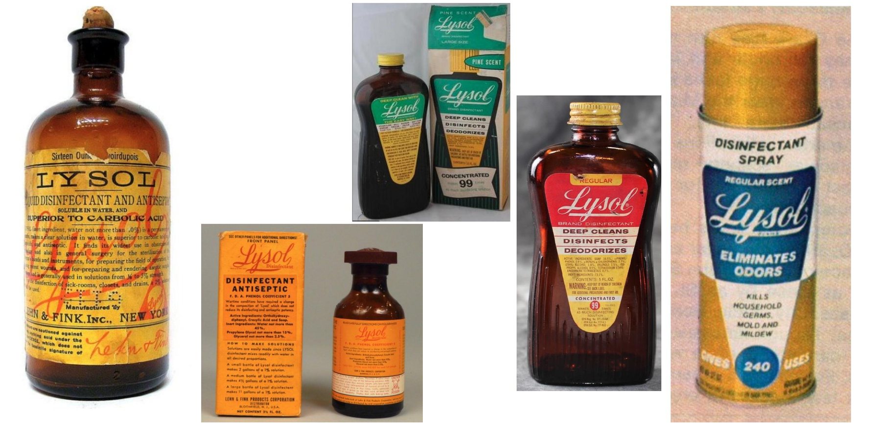
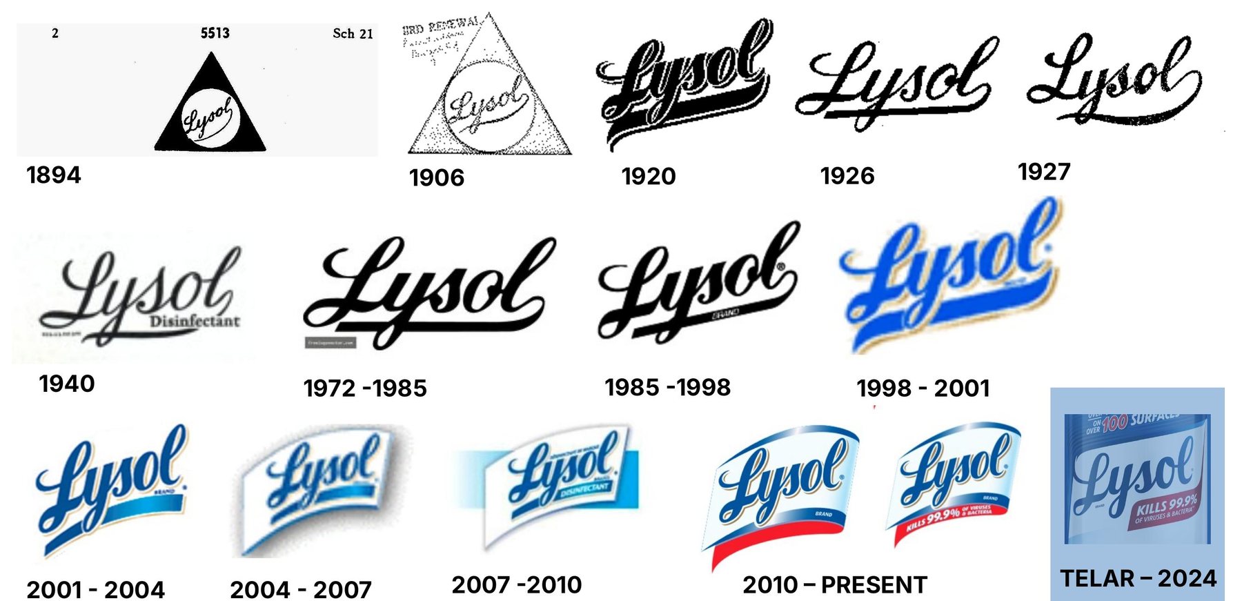
Lysol has been in people's homes since the late nineteenth century: an amber bottle of disinfectant, then decades of tins, cans and trigger sprays, with the script wordmark redrawn again and again along the way.
That history is an asset, but it had also left layers. Over the years the brand and its products had lost shelf visibility, design consistency and impact, in a category most people find low-interest and purely functional.
02 · The challenge
Generic on shelf
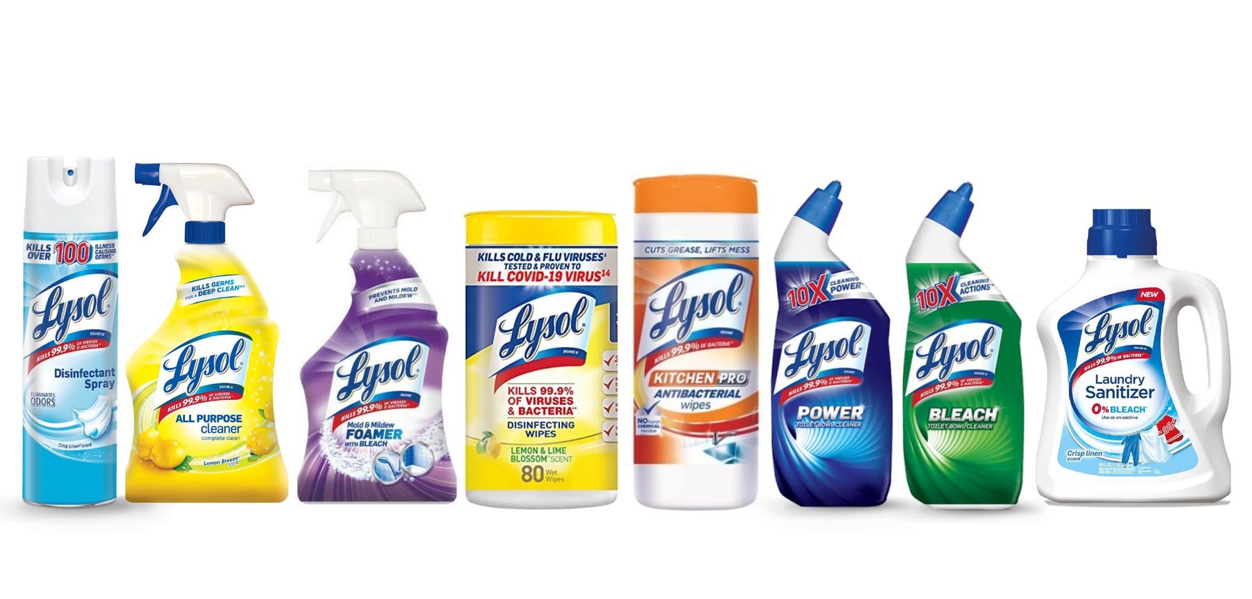
The identity looked dated and the packs looked generic for the category. The logo was the only asset that truly expressed the brand; the other visual cues it relied on had been taken up by competitors and private label alike.
The challenge was to refresh the design so it strengthened Lysol's germ-kill efficacy credentials and readied the brand for a new, modern era: better sensorial communication, and a clearer, stronger brand block on both the physical and the digital shelf.
03 · Ambition
Modernise, harmonise, simplify
01
Modernise our assets
Focus the brand's assets for legibility and impact, sharpen the use of colour for standout, and build in the flexibility a digital shelf needs.
02
Harmonise our range
One design system that follows the way people shop: find the brand, then the segment, then the product.
03
Simplify our shelf
Brand-block by shape and colour for instant recognition, organise the pack architecture, and cut the noise so the distinctive assets can do their work.
04 · Design idea
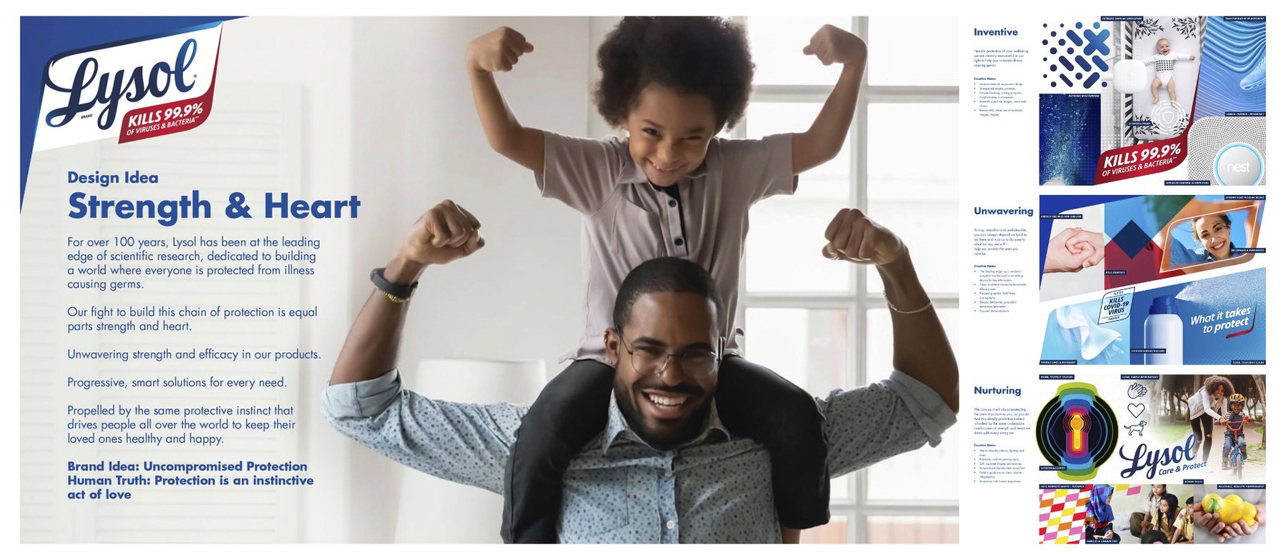
Strength & Heart
For more than a hundred years Lysol has led on the science of germ protection. Its fight to build a chain of protection is equal parts strength and heart: unwavering strength and efficacy in the products, and the same protective instinct that drives every parent and caregiver to keep the people they love healthy.
Uncompromised protection. Protection is an instinctive act of love.
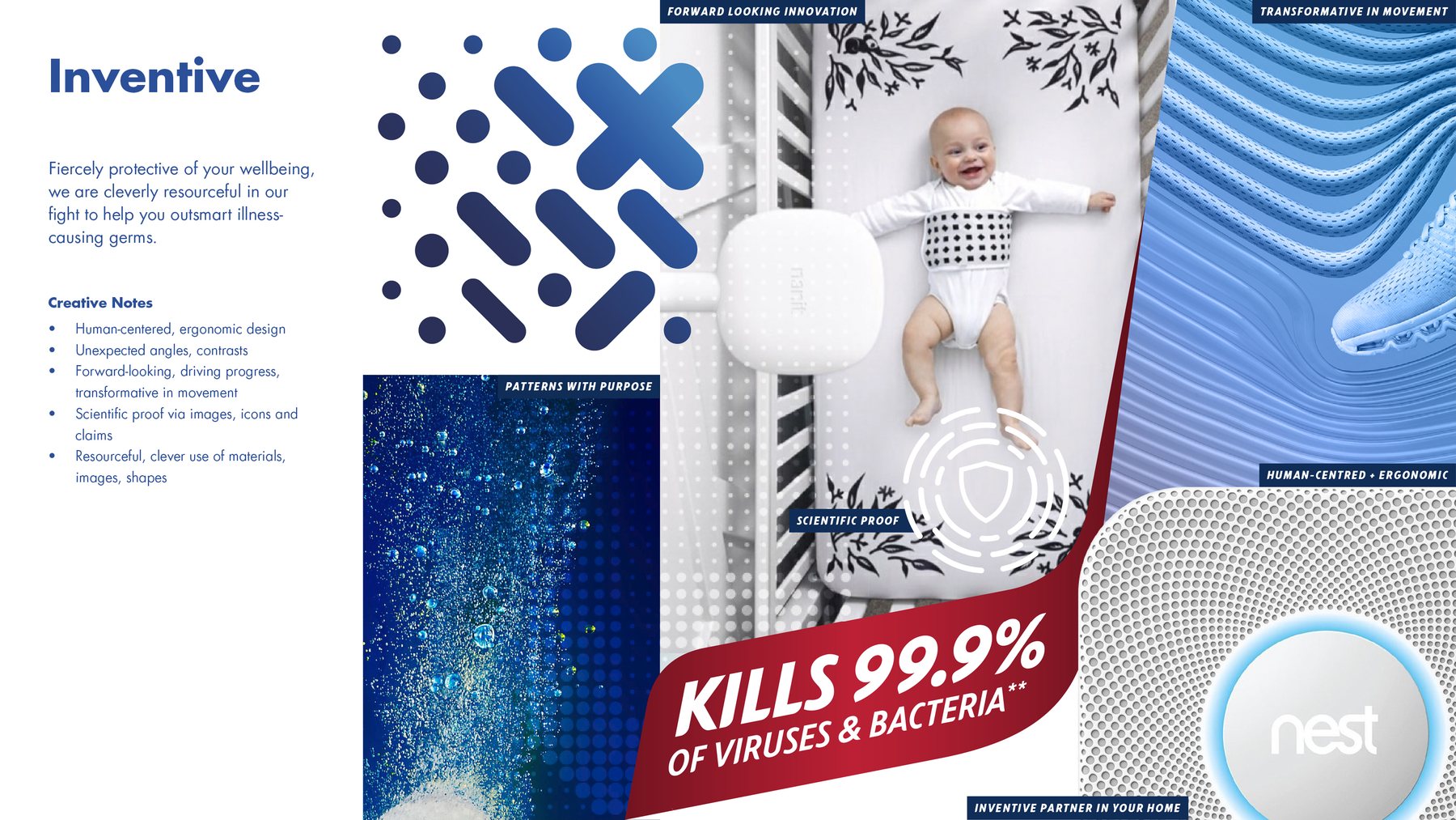
Inventive
Fiercely protective of your wellbeing, and cleverly resourceful in the fight to outsmart illness-causing germs.
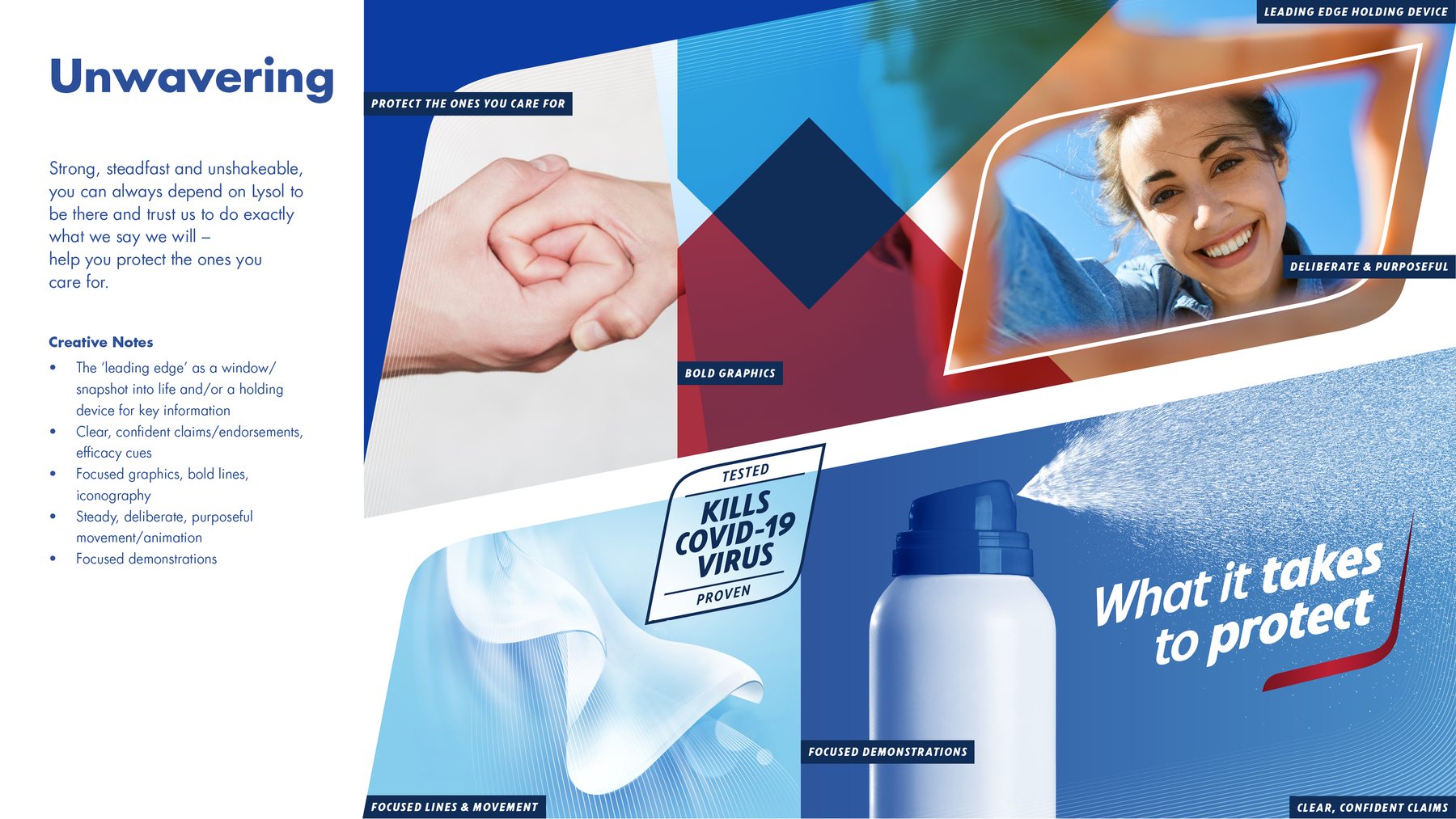
Unwavering
Strong, steadfast and unshakeable: there when it counts, and true to what it says it will do.
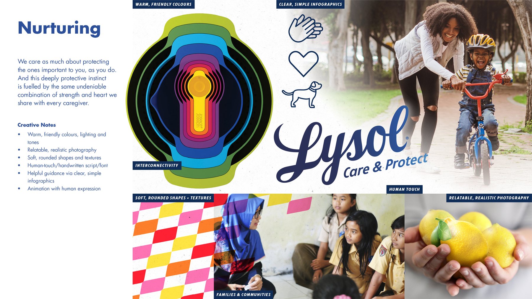
Nurturing
Caring as much about the people you protect as you do, with a warmth shared with every caregiver.
05 · The brandmark
The Leading Edge
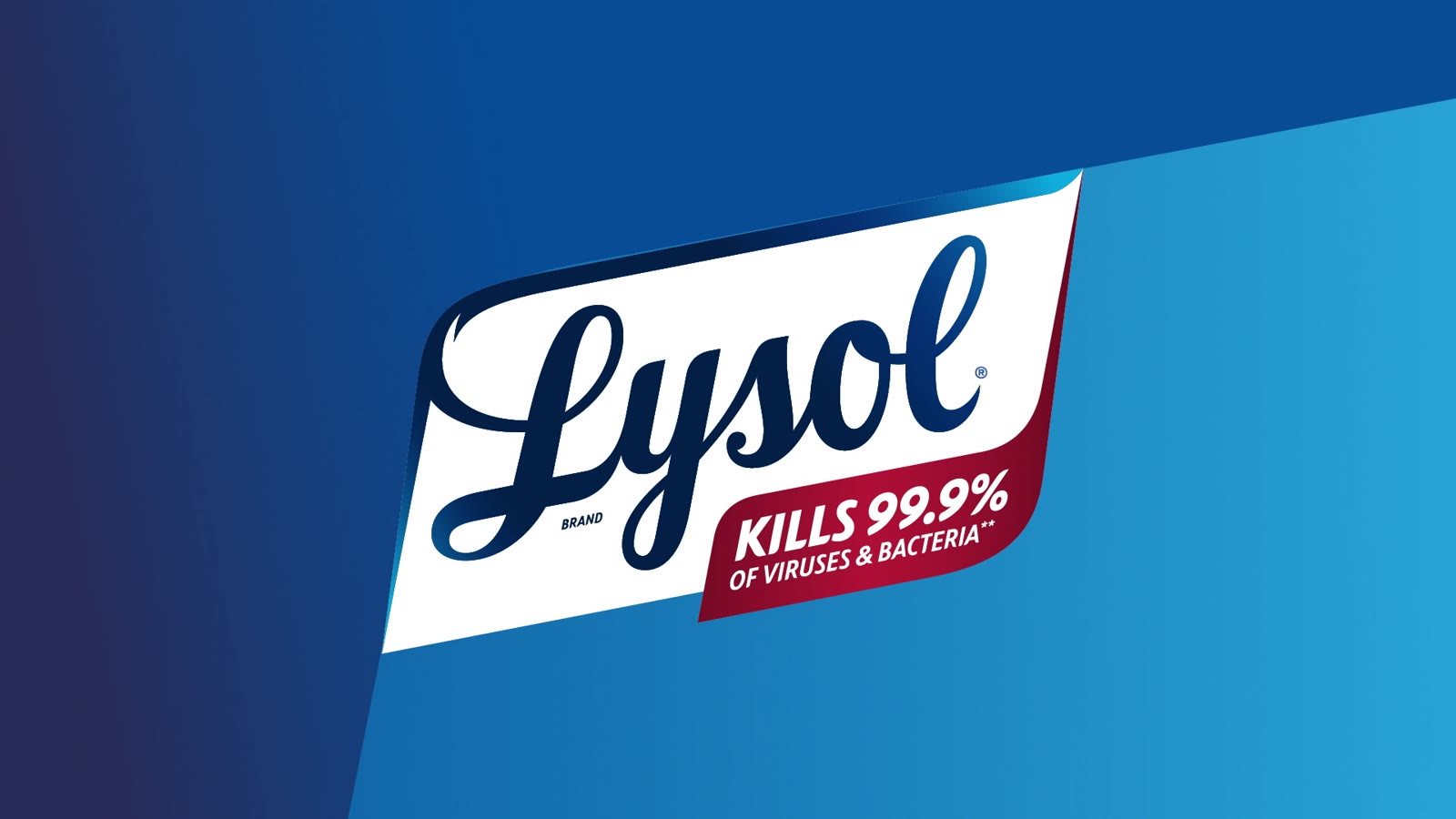
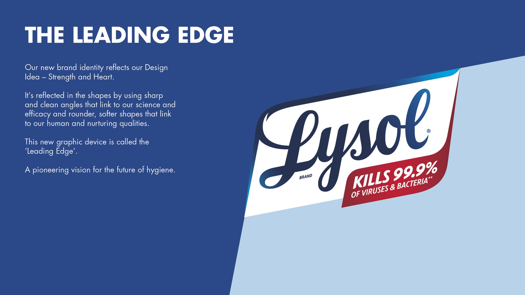
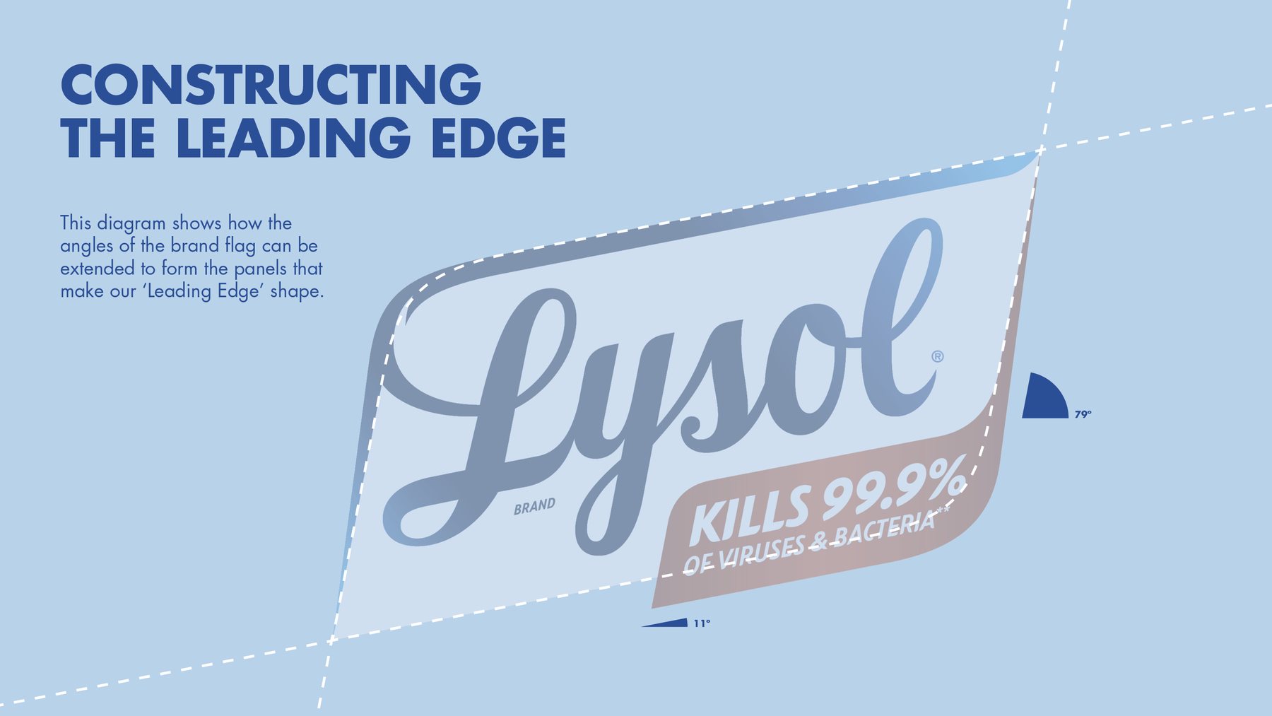
The new identity puts the design idea into shape. Sharp, clean angles speak to science and efficacy; rounder, softer forms speak to the human, nurturing side. Together they make a new graphic device, the Leading Edge.
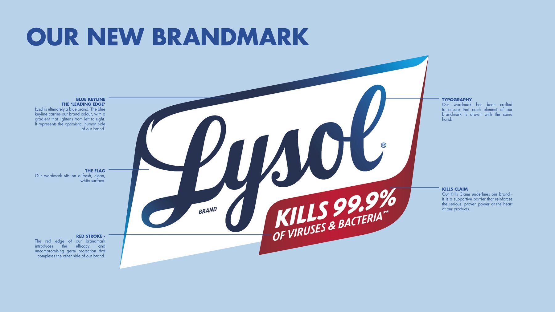
- Blue keyline
- The Leading Edge. Lysol is ultimately a blue brand; the keyline carries the brand colour in a gradient that lightens from left to right, for optimism and forward momentum.
- The flag
- The wordmark sits on a fresh, clean, white surface.
- Typography
- The script wordmark, redrawn so every element of the brandmark feels drawn by the same hand.
- Red stroke
- Introduces the efficacy and uncompromising germ protection that completes the other side of the brand.
- Kills claim
- Underlines the brand: a supportive banner that reinforces the serious, proven power at the heart of the products.
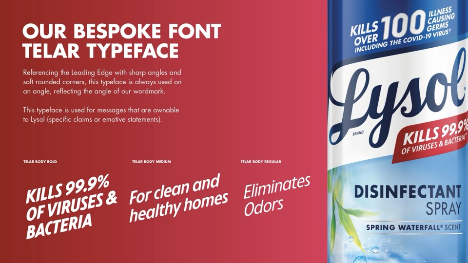
A bespoke typeface
The Leading Edge carries into type. Telar has the same sharp angles and soft rounded corners, and is always set on the angle of the wordmark. It is kept for the messages only Lysol can own: its specific claims and its emotive statements.
06 · Packaging
One system across the range
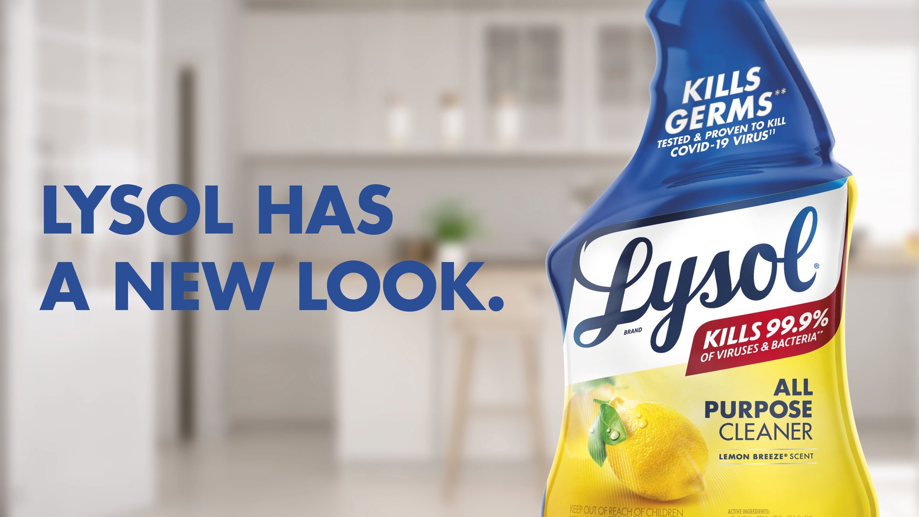
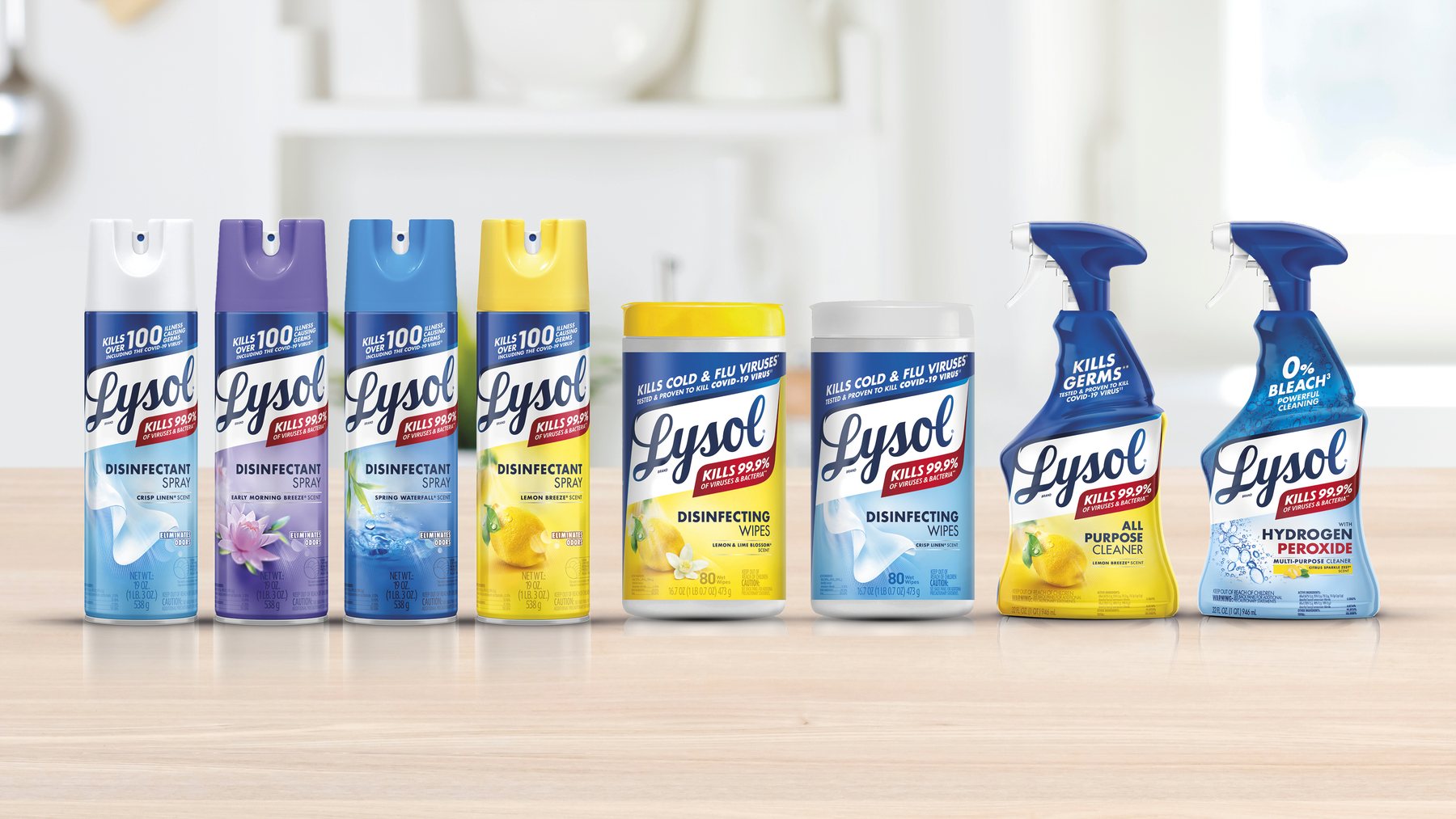
On pack, the Leading Edge becomes a frame the whole range shares. The brandmark leads, colour signals the segment, and the product name follows: find the brand, then the segment, then the product, wherever the shopper starts.
07 · Connected packs
Scan the pack, open the product
Every pack also opens onto a screen. Built on the connected pack architecture I set up for Reckitt's Hygiene business, each product carries its own identifier through the artwork process, so a scan leads to an experience made for that exact product, not a generic landing page.
For Lysol, that means how and where to use it, the other scents in its range, and a cleaning toolkit that brings in the products that work alongside it, ending with an invitation to stay in touch. The pack keeps working long after it leaves the shelf.
08 · Brand world
Every touchpoint, one story
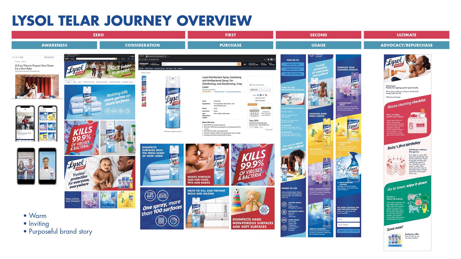
The brand world takes the identity across the whole shopper journey, from awareness and consideration through purchase and use to advocacy and repurchase. Where the old touchpoints spoke in many voices, the new ones share one that is warm, inviting and purposeful.
09 · The journey
From strategy to sign-off
- Stage 1 · Mar 2019 – Aug 2021Strategy and core design development
- Stage 2 · Jan – Mar 2022Pack architecture and strategic design dimensions
- Stage 3 · Apr – Aug 2022Cross-sell mechanic and brand world
- OutcomeThe redesign taken through to board-level sign-off
10 · My role
Leading it client-side
As Global Brand Experience Lead at Reckitt, I led Lysol's brand experience while it was the largest brand in the portfolio, working with Design Bridge as lead strategic design agency. I owned the brief and the brand experience across the range, managed the agency relationship, kept consumer testing at the heart of the design work, and drove the redesign through to approval at board level.
Design: Design Bridge // Client: Reckitt